Gtk.Switch
Example
- Subclasses:
None
Methods
- Inherited:
Gtk.Widget (183), GObject.Object (37), Gtk.Accessible (17), Gtk.Buildable (1), Gtk.Actionable (5)
- Structs:
class |
|
|
|
|
|
|
|
|
Virtual Methods
Properties
- Inherited:
Name |
Type |
Flags |
Short Description |
|---|---|---|---|
r/w/en |
|||
r/w/en |
Signals
- Inherited:
Name |
Short Description |
|---|---|
Emitted to animate the switch. |
|
Emitted to change the underlying state. |
Fields
- Inherited:
Class Details
- class Gtk.Switch(**kwargs)
- Bases:
- Abstract:
No
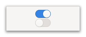
Shows a “light switch” that has two states: on or off.
<picture> <source srcset=”switch-dark.png” media=”(prefers-color-scheme: dark)”> <img alt=”An example
Gtk.Switch" src=”switch.png”> </picture>The user can control which state should be active by clicking the empty area, or by dragging the slider.
GtkSwitchcan also express situations where the underlying state changes with a delay. In this case, the slider position indicates the user’s recent change (represented by the [property`Gtk`.Switch:active] property), while the trough color indicates the present underlying state (represented by the [property`Gtk`.Switch:state] property).<picture> <source srcset=”switch-state-dark.png” media=”(prefers-color-scheme: dark)”> <img alt=”
Gtk.Switchwith delayed state change” src=”switch-state.png”> </picture>See [signal`Gtk`.Switch::state-set] for details.
- Shortcuts and Gestures
GtkSwitchsupports pan and drag gestures to move the slider.- CSS nodes
`` switch ├── image ├── image ╰── slider ``
GtkSwitchhas four css nodes, the main node with the name switch and subnodes for the slider and the on and off images. Neither of them is using any style classes.- Accessibility
GtkSwitchuses the [enum`Gtk`.AccessibleRole.switch] role.- classmethod new()[source]
- Returns:
the newly created
GtkSwitchinstance- Return type:
Creates a new
GtkSwitchwidget.
- get_state()[source]
- Returns:
the underlying state
- Return type:
Gets the underlying state of the
GtkSwitch.
Signal Details
- Gtk.Switch.signals.activate(switch)
- Signal Name:
activate- Flags:
- Parameters:
switch (
Gtk.Switch) – The object which received the signal
Emitted to animate the switch.
Applications should never connect to this signal, but use the [property`Gtk`.Switch:active] property.
- Gtk.Switch.signals.state_set(switch, state)
- Signal Name:
state-set- Flags:
- Parameters:
switch (
Gtk.Switch) – The object which received the signalstate (
bool) – the new state of the switch
- Returns:
Trueto stop the signal emission- Return type:
Emitted to change the underlying state.
The
::state-setsignal is emitted when the user changes the switch position. The default handler calls [method`Gtk`.Switch.set_state] with the value of state.To implement delayed state change, applications can connect to this signal, initiate the change of the underlying state, and call [method`Gtk`.Switch.set_state] when the underlying state change is complete. The signal handler should return
Trueto prevent the default handler from running.
Property Details
- Gtk.Switch.props.active
- Name:
active- Type:
- Default Value:
- Flags:
Whether the
GtkSwitchwidget is in its on or off state.
- Gtk.Switch.props.state
- Name:
state- Type:
- Default Value:
- Flags:
The backend state that is controlled by the switch.
Applications should usually set the [property`Gtk`.Switch:active] property, except when indicating a change to the backend state which occurs separately from the user’s interaction.
See [signal`Gtk`.Switch::state-set] for details.