Gtk.ActionBar
Example
- Subclasses:
None
Methods
- Inherited:
Gtk.Widget (183), GObject.Object (37), Gtk.Accessible (18), Gtk.Buildable (1)
- Structs:
class |
|
|
|
|
|
|
|
|
|
|
|
|
Virtual Methods
- Inherited:
Gtk.Widget (25), GObject.Object (7), Gtk.Accessible (7), Gtk.Buildable (9)
Properties
- Inherited:
Name |
Type |
Flags |
Short Description |
|---|---|---|---|
r/w/en |
Signals
- Inherited:
Fields
- Inherited:
Class Details
- class Gtk.ActionBar(**kwargs)
- Bases:
- Abstract:
No
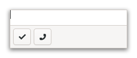
Presents contextual actions.
<picture> <source srcset=”action-bar-dark.png” media=”(prefers-color-scheme: dark)”> <img alt=”An example
Gtk.ActionBar" src=”action-bar.png”> </picture>GtkActionBaris expected to be displayed below the content and expand horizontally to fill the area.It allows placing children at the start or the end. In addition, it contains an internal centered box which is centered with respect to the full width of the box, even if the children at either side take up different amounts of space.
The
GtkActionBarimplementation of theGtkBuildableinterface supports adding children at the start or end sides by specifying “start” or “end” as the “type” attribute of a<child>element, or setting the center widget by specifying “center” value.- CSS nodes
`` actionbar ╰── revealer
- ╰── box
├── box.start │ ╰── [start children] ├── [center widget] ╰── box.end
╰── [end children]
A
GtkActionBar’s CSS node is calledactionbar. It contains arevealersubnode, which contains aboxsubnode, which contains twoboxsubnodes at the start and end of the action bar, withstartandendstyle classes respectively, as well as a center node that represents the center child.Each of the boxes contains children packed for that side.
- classmethod new()[source]
- Returns:
a new
GtkActionBar- Return type:
Creates a new action bar widget.
- get_center_widget()[source]
- Returns:
the center widget
- Return type:
Gtk.WidgetorNone
Retrieves the center bar widget of the bar.
- get_revealed()[source]
- Returns:
the current value of the [property`Gtk`.ActionBar:revealed] property
- Return type:
Gets whether the contents of the action bar are revealed.
- pack_end(child)[source]
- Parameters:
child (
Gtk.Widget) – the widget to be added
Adds a child to the action bar, packed with reference to the end of the action bar.
- pack_start(child)[source]
- Parameters:
child (
Gtk.Widget) – the widget to be added
Adds a child to the action, packed with reference to the start of the action bar.
- remove(child)[source]
- Parameters:
child (
Gtk.Widget) – the widget to be removed
Removes a child from the action bar.
- set_center_widget(center_widget)[source]
- Parameters:
center_widget (
Gtk.WidgetorNone) – a widget to use for the center
Sets the center widget for the action bar.