Gtk.Frame
Example
- Subclasses:
None
Methods
- Inherited:
Gtk.Widget (183), GObject.Object (37), Gtk.Accessible (18), Gtk.Buildable (1)
- Structs:
class |
|
|
|
|
|
|
|
|
|
|
|
|
Virtual Methods
- Inherited:
Gtk.Widget (25), GObject.Object (7), Gtk.Accessible (7), Gtk.Buildable (9)
|
Properties
- Inherited:
Name |
Type |
Flags |
Short Description |
|---|---|---|---|
r/w/en |
|||
r/w/en |
|||
r/w/en |
|||
r/w/en |
Signals
- Inherited:
Fields
- Inherited:
Name |
Type |
Access |
Description |
|---|---|---|---|
parent_instance |
r |
Class Details
- class Gtk.Frame(**kwargs)
- Bases:
- Abstract:
No
- Structure:
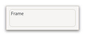
Surrounds its child with a decorative frame and an optional label.
<picture> <source srcset=”frame-dark.png” media=”(prefers-color-scheme: dark)”> <img alt=”An example
Gtk.Frame" src=”frame.png”> </picture>If present, the label is drawn inside the top edge of the frame. The horizontal position of the label can be controlled with [method`Gtk`.Frame.set_label_align].
GtkFrameclips its child. You can use this to add rounded corners to widgets, but be aware that it also cuts off shadows.An example of a UI definition fragment with
Gtk.Frame:``xml <object class=”GtkFrame”>
- <property name=”label-widget”>
<object class=”GtkLabel” id=”frame_label”/>
</property> <property name=”child”>
<object class=”GtkEntry” id=”frame_content”/>
</property>
</object> ``
- CSS nodes
`` frame ├── <label widget> ╰── <child> ``
GtkFramehas a main CSS node with name “frame”, which is used to draw the visible border. You can set the appearance of the border using CSS properties like “border-style” on this node.- Accessibility
GtkFrameuses the [enum`Gtk`.AccessibleRole.group] role.- classmethod new(label)[source]
- Parameters:
label (
strorNone) – the text to use as the label of the frame- Returns:
a new
GtkFramewidget- Return type:
Creates a new
GtkFrame, with optional label label.If label is
None, the label is omitted.
- get_child()[source]
- Returns:
the child widget of self
- Return type:
Gtk.WidgetorNone
Gets the child widget of self.
- get_label()[source]
- Returns:
the text in the label, or
Noneif there was no label widget or the label widget was not aGtkLabel. This string is owned by GTK and must not be modified or freed.- Return type:
Returns the frame labels text.
If the frame’s label widget is not a
GtkLabel,Noneis returned.
- get_label_align()[source]
- Returns:
the frames X alignment
- Return type:
Retrieves the X alignment of the frame’s label.
- get_label_widget()[source]
- Returns:
the label widget
- Return type:
Gtk.WidgetorNone
Retrieves the label widget for the frame.
- set_child(child)[source]
- Parameters:
child (
Gtk.WidgetorNone) – the child widget
Sets the child widget of self.
- set_label(label)[source]
-
Creates a new
GtkLabelwith the label and sets it as the frame’s label widget.
- set_label_align(xalign)[source]
- Parameters:
xalign (
float) – The position of the label along the top edge of the widget. A value of 0.0 represents left alignment; 1.0 represents right alignment.
Sets the X alignment of the frame widget’s label.
The default value for a newly created frame is 0.0.
- set_label_widget(label_widget)[source]
- Parameters:
label_widget (
Gtk.WidgetorNone) – the new label widget
Sets the label widget for the frame.
This is the widget that will appear embedded in the top edge of the frame as a title.
- do_compute_child_allocation(allocation) virtual
- Parameters:
allocation (
Gdk.Rectangle) –
Property Details
- Gtk.Frame.props.child
- Name:
child- Type:
- Default Value:
- Flags:
The child widget.
- Gtk.Frame.props.label
- Name:
label- Type:
- Default Value:
- Flags:
Text of the frame’s label.
- Gtk.Frame.props.label_widget
- Name:
label-widget- Type:
- Default Value:
- Flags:
Widget to display in place of the usual frame label.
- Gtk.Frame.props.label_xalign
- Name:
label-xalign- Type:
- Default Value:
0.0- Flags:
The horizontal alignment of the label.